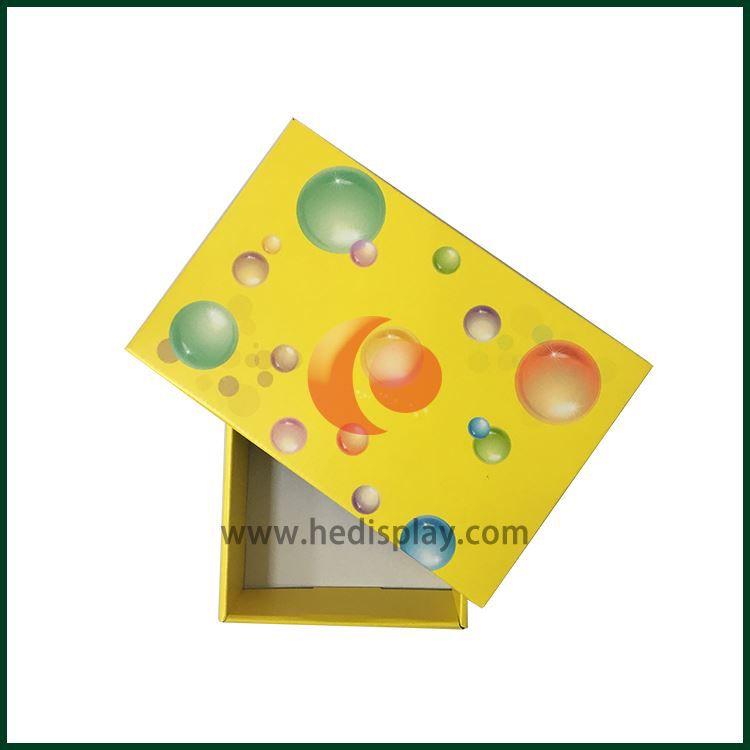
When designing the packaging box, the color skills should pay attention to the following points: one is the anaphoric relationship between color and packaging; the other is the contrast relationship between color and color itself. These two points are the key to the use of color.
Anaphora
So, where should we talk about the anaphoric relationship between color and packaging? Mainly through the external packaging color can reveal or reflect the inner packaging items. One can basically perceive or think of the inner packaging when looking at the outer packaging. The author has mentioned this problem many times in the past articles, but if we can walk into the store and take a look at the goods, many products have not reflected this kind of caring relationship. It makes consumers unable to think of what the packaged goods are from the outside. Of course, it will not play an active promotional role in product sales. The color of the normal external packaging should grasp the same characteristics to varying degrees;
(1) To advance from the industry, the food packaging category normally uses the main colors of goose yellow and pink to express it, which gives people a sense of warmth and closeness. Of course, tea uses a lot of green, drinks, a lot of green and blue, wines and cakes, a lot of red, children's food, a lot of rose, and daily cosmetics are normal colors. The main colors are mostly rose, pink, white, light green, light blue, and dark coffee to highlight the warm and elegant sentiment. The clothing and footwear are mostly dark green, dark blue, coffee or gray to emphasize calmness. The beauty of elegance is emphasized.
In terms of performance characteristics, as far as food is concerned, cakes and desserts are mostly golden and light yellow to give people an impression of aroma; tea, beer and other beverages are mostly red or green, which symbolizes the richness and aroma of tea; tomato juice , Apple juice is mostly red, which shows the natural attributes of the item. Although some packages do not use colors with similar product attributes from the main color as mentioned above, if you look carefully, if the design of the package is written by your own home, then in the picture of its outer package There must be a symbolic color block, color dot, color line or concentrated content highlighted by that color of the sunny pen. This should be everyone's proud work. Many such examples can be found in the packaging of some clothing, some cosmetic packaging, and even some wine packaging.

 English
 русский
 Italiano
 Deutsch
 Türkçe
 Português
 한국어
한국어 日本語
日本語 Français
 عر
عر Việt Nam
 Español