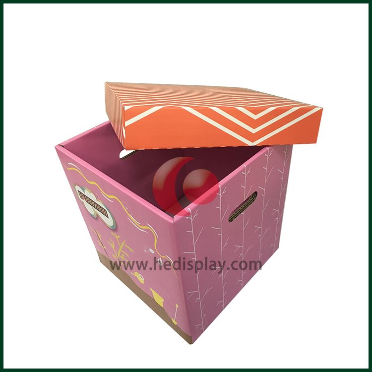
The use of color contrast (or called the contrast of depth and light) is also one of the important reproduction techniques in the use of packaging colors. This kind of light and heavy contrast is often used to set off a solemn and deep theme pattern on a light and elegant background, or in a solemn and deep theme pattern (mostly with color block patterns as the emphasis). Show the theme and name of the light and elegant packaging, as well as trademarks or slogans. Conversely, there is also a large area of dignified and deep pigments. In addition, use light and elegant tones or focus on a certain color block or fully decorate some patterns. In this kind of light and heavy contrast, general pigments have coordinated color contrast and cold-warm color contrast. The method of coordinated color contrast is often light green to dark green; light* to dark coffee; pink to red, etc., while the contrast of cold and warm colors is mostly Black and white, red and blue, etc.

 English
 русский
 Italiano
 Deutsch
 Türkçe
 Português
 한국어
한국어 日本語
日本語 Français
 عر
عر Việt Nam
 Español